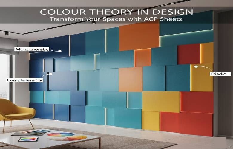
Colour Theory in Design: Transform Your Spaces with ACP Sheets
In modern architecture and design, colour isn’t just an aesthetic choice; it’s a language that speaks emotions, defines atmosphere, and shapes how people experience a space.
When paired with the narrow, modern texture of ACP sheets, colour becomes a strong tool for turning buildings, interiors, and commercial settings into works of art.
The ACP Sheet celebrates this very idea, offering a wide palette that blends visual harmony with bold creativity. From inviting reds, to serene blues and neutral whites, each colour provides a personality and design direction. Let us examine colour theory and how you may create a beautiful space using ACP sheets.
Understanding Colour Theory in ACP Sheet Design
Before getting into the specific shades, it's best to understand the base foundation of colour theory. Colours are classified into three categories: warm, cool, and neutral.
- Warm tones (red, orange, yellow, and brown) provide energy with warmth and excitement to a space.
- Cool tones (blue and green) provide calmness, freshness, and balance.
- Neutral tones (white, grey, and black) provide contrast, clarity, and sophistication.
Designers frequently choose a combination of these tones to create an equilibrium between vibrancy and comfort. And that's where the ACP Sheet Collection shines, providing every stone necessary to build that gorgeous palette.
Exploring the Emotion Behind Colours

Before we examine specific tints, it's important to understand how each colour group influences mood and perception. Warm, cool, and neutral tones all have their own distinctive character and energy to contribute to the design, especially in relation to ACP sheets.
The Power of Warm Colours
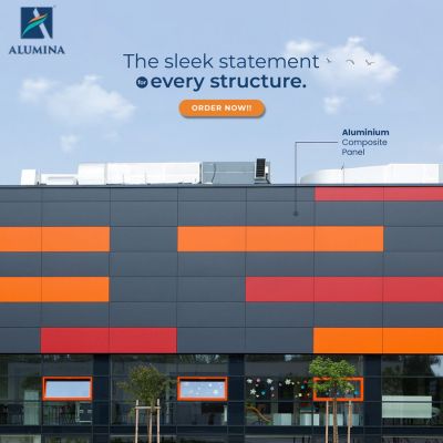
Warm colors inherently draw attention and carry an energetic quality that makes them perfect for entrances, façades, and accent walls where you want the space to grab attention.
- Both Red and Ruby Red display excitement, energy, and confidence. They’re ideal for retail storefronts, restaurants, and any workplace using creative design, where things are happening, and excitement is prevalent.
- The color Orange has a lively, modern feel, lending it allusions to youthfulness and active environments.
- Lemon Yellow and Traffic Yellow instill cheerful and inviting environments. These colors work well for school buildings, cafes, and signage, providing an instant dose of positivity.
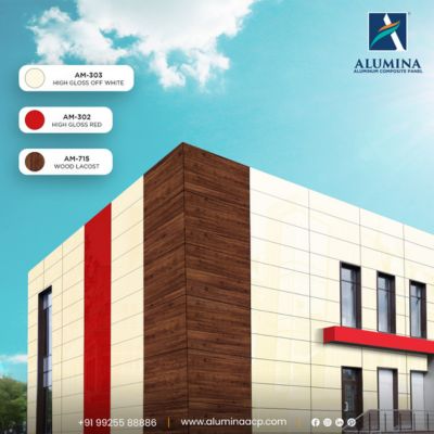
- Choco Brown balances the bold colors nicely by providing a sense of stability and warmth to ground the designs.
Warm colors using ACP sheets can help you achieve vibrant compositions that will create energy in exteriors and interiors.
The Calm of Cool Colours
If you desire to create a serene, harmonious, and elegant environment, cool colours will definitely be your friend. These were chosen based on their ease of visual relief; many environments (corporate, healthcare, or residential) use these colours for this reason.
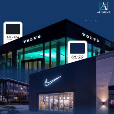
- Classic Blue and Dark Blue signify intelligence, depth, and calmness, making them ideal options for office or educational settings.
- Vivo Blue and Nayara Blue have a contemporary creative feel. Pair with whites or greys, and these colours become fresh and lively centres for commercial spaces.
- Refresh Green and Oppo Green help bring a sense of balance and creative forward energy. Ideal for eco-themed projects, wellness spas, or green façades working in harmony with nature.
- Purple adds a sense of luxury and creativity, best suited for boutique spaces, salons, or art galleries.
When cool colours are used in combination with neutral colours such as white or grey ACP sheets, the result displays sophistication that is pleasing to the eye and not exorbitant.
The Balance of Neutrals
Every bold design needs balance, and that’s where neutral ACP sheets come in. They act as grounding elements, creating visual contrast and structure.
- White, Snow White, and Off White represent simplicity, purity, and openness. These are perfect for hospitals, showrooms, and minimalist designs.
- Black adds drama, sophistication, and contrast, ending up making other colours pop.
- Slate Grey brings an industrial, modern appeal that works beautifully for corporate buildings or modern homes.
Neutral tones in ACP sheet applications are timeless, they allow architects and designers to create harmony without losing elegance.
ACP Sheet Colour Combinations for Perfect Harmony
The real magic of design is in the strategic use of colour palettes. The ACP Sheet palette's colors allow the decorator to play with warm, cool and neutrals in order to arrive at the feel and energy desired in the space.
Here are a few tested combinations:
- Red + Black: Bold and self-assured for high-end retail stores or brand-centric spaces.
- White + Dark Blue: Crisp, balanced, and businesslike for all offices or institutions.
- Lemon Yellow + Slate Grey: A bright but balanced pairing for contemporary homes and showrooms.
- Oppo Green + Off White: Fresh and natural, a winner for nature-oriented or health care, also.
- Burgundy + Snow White: Sophisticated and classic, perfectly suited for hotel lobbies and home exteriors.
These combinations, matched with the skill of ACP sheet installation, create visuals dynamically in designs that mimic both styles and purpose.
Popular Applications of Colour ACP Sheets
Before we explore combinations and contrasts, it is just as important to know how we can use different colour applications throughout different spaces, from exteriors to interiors, to signage and decor, to take advantage of your ACP sheet design truly.
- Facades: Select strong or contrasting colors for your exterior to distinguish your building. Classic Blue and White would create a clear corporate identity, while Red and Choco Brown enhance the excitement of the facades.
- Interiors: Introduce the soft blues and greens in the office interiors and bright yellows and oranges in the public areas or cafeterias to keep the energy high.
- Signage and Branding: Ruby Red and Traffic Yellow are excellent in elevating logos or signage visibility and prominence.
- Ceilings and Partitions: Combine Slate Grey with lighter colors for depth and complexity.
Colour not only establishes mood, but it also assists in brand identification, light reflection, and perception of space. With ACP sheets, designers can make these theories a reality due to their ease of fabrication, durability, and premium quality finish.
Conclusion
There are limitless creative possibilities with the Plain Colored ACP Sheet Collection. These offer calming blues through to energizing reds. Each color, whether warm, cool, or neutral, has a purpose, and ultimately, that will serve to define the mood and utility in your space.
Where colour meets quality, design is transformed. That is the power of Alumina. Discover the full ACP Sheet range to bring richness, accuracy, and contemporary presentation to your architecture. When you choose a colour with Alumina, you are not choosing a colour, you are choosing a story your space will tell for years to come.
Frequently Asked Questions
Colours in ACP Sheet design influence mood and perception — warm tones add energy, cool tones bring calmness, and neutrals balance the design.
Popular combinations include Red & Black for boldness, White & Blue for professionalism, and Yellow & Grey for contemporary appeal.
They offer a clean, consistent look ideal for modern architecture, easy maintenance, and vast colour flexibility for design harmony.
Leading ACP Sheet Manufacturer
As a proud representative of Alumina ACP, a premier manufacturer of Aluminum Composite Panels, I bring a wealth of expertise in acp sheets and addressing diverse architectural needs with innovative solutions. Join me on this journey of exploration and discovery!