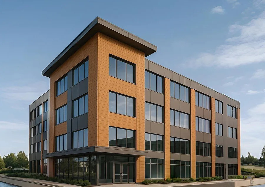
How to Choose the Right Colour ACP Sheet for Your Building Exterior
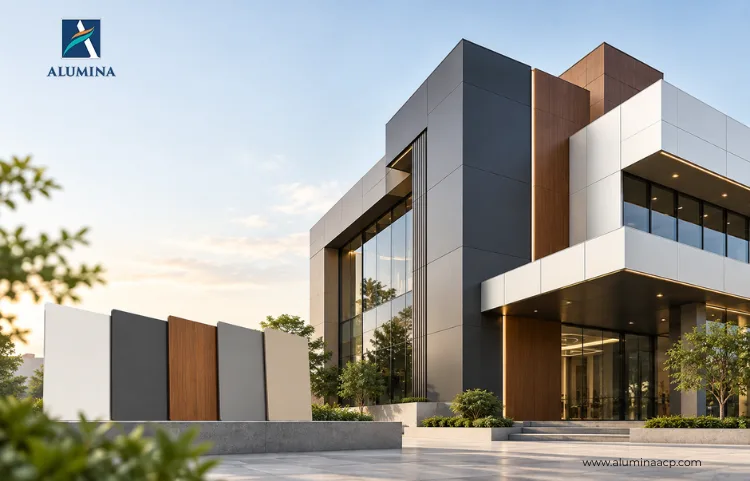
A facade colour looks very different on a 6-inch sample than it does across six floors.
That is where many exterior decisions go wrong.
The architect approves a shade under indoor lighting. The client likes it on the mood board. Then the ACP Sheet goes up and suddenly the colour feels too dark, too bright, too reflective or completely different under afternoon sunlight.
For architects, developers and building owners, colour is not the final decorative decision.
It affects how large the building feels, how easily it is noticed, how well it fits its surroundings and even how frequently dirt becomes visible.
So before choosing between silver, grey, blue, bronze or white, look at the building first.
The Right facade Colour Starts with the Building, Not the Shade Card
An office tower, hospital, retail showroom and private residence cannot be approached the same way. Think about scale, architecture, surroundings, sunlight and brand personality before narrowing down the ACP Sheet colour.
1. Start With the Size of the facade
Dark colours can look sophisticated on a sample. Across a very large elevation, however, they can become visually dominant.
For bigger buildings, lighter shades such as Bright Silver can help create a cleaner and more expansive appearance. For smaller commercial buildings can take stronger colours more confidently.
A showroom entrance in Metallic Bronze or Black Silver, for example, can create a more defined architectural identity without overwhelming the structure.
The question is not simply:
“Which colour looks premium?”
It is:
“How will this colour behave when multiplied across the entire facade?”
2. Watch the Colour in Real Sunlight
A metallic surface does not remain visually static throughout the day. Morning light, direct afternoon sun and evening shadows can all change how it appears.
That is part of the attraction.
Metallic finishes are designed to provide a reflective, sleek appearance and are available in shades such as Bright Silver, Penny Copper, Rich Gold and Jade Green,
Before approving one, take the sample outside.
Look at it:
- In direct sunlight
- Under shade
- From several metres away
- Beside glass, stone or other facade materials
3. Match the Colour to the Building’s Personality
Colour communicates before anyone reads the signage.
- A corporate office may need confidence and restraint.
- A retail showroom may need visibility.
- A hospital may need something cleaner and calmer.
- A restaurant or boutique commercial project can afford more character.
For a modern corporate facade, Slate Grey, Metallic Silver, Champagne Silver or Black Silver can create a controlled palette.
For warmer architecture, consider Pearl Brown, Choco Brown, Penny Copper or Metallic Bronze.
Want more personality?
Solid options such as Dark Blue, Classic Blue, Burgundy, Refresh Green, Red or Orange can help create stronger visual identity. The solid range is designed around uniform, bold colours with high vibrancy and a smooth finish.
The facade should say something about the building before someone walks inside.
4. Do Not Use One Colour Everywhere
Sometimes the problem is not choosing the wrong colour. It is using too much of the right one. A complete facade in one strong shade can quickly become heavy.
Instead, build a hierarchy.
For example:
Snow White + Slate Grey
Clean and contemporary.
Champagne Silver + Metallic Bronze
Warmer and more premium.
Bright Silver + Dark Blue
Sharper corporate character.
Off White + Choco Brown
Softer residential or hospitality feel.
5. Think About What the facade Will Look Like After the First Monsoon
Architects understandably focus on appearance. Facility teams think about dirt.
Very light colours can show certain stains easily, while extremely dark finishes may make dust or water marks more noticeable depending on the location.
That does not mean avoiding either.
It means considering building use and maintenance access before deciding.
Exterior ACP should also be evaluated for finish durability. Metallic sheets are described as UV-resistant and designed to minimise fading with prolonged sunlight exposure, while solid-colour sheets use PVDF coating for weather resistance and colour longevity.
Choose the shade for today. Choose the finish for the years ahead.
Why Choose Alumina ACP Sheet?
At ALUMINA, we believe colour selection should give architects more freedom, not more limitations.
Our ACP range includes diverse finishes across different shades. Buyers can also access multiple panel thicknesses and sizes, along with PVDF-coated options designed for exterior weather performance with 10 years of manufacturing warranty.
The aim is simple: give every facade a colour that fits the design and a finish built to stay part of it.
Do Not Pick a Colour. Build a facade Palette.
The best exterior colour is not necessarily the boldest or safest shade. It is the one that makes the architecture feel intentional.
Explore the Alumina ACP catalogue to find the palette that can give your next building its own unmistakable identity.
Frequently Asked Questions
Consider building size, architecture, sunlight, surrounding materials, building use, maintenance requirements, local climate and the coating system of the selected ACP sheet.
They can be, but the visual effect should be evaluated at facade scale. Dark colours may create a stronger visual presence, so architects should assess the complete elevation rather than relying only on a small sample.
Metallic ACP finishes can be used for exterior applications when the specific product is designed and specified for exterior exposure. Buyers should check the manufacturer's coating and weather-performance documentation.
There is no single colour that is easiest to maintain in every environment. Dust, pollution, rainfall and the surrounding environment can affect how visible marks are on different colours.
It depends on the desired architectural effect. Metallic colours can create a more reflective contemporary appearance, while solid colours can provide a more uniform and bold visual identity.
Natural sunlight, shadows and surrounding materials can change how a colour is perceived compared with indoor lighting or a small shade card.

Leading ACP Sheet Manufacturer
As a proud representative of Alumina ACP, a premier manufacturer of Aluminum Composite Panels, I bring a wealth of expertise in acp sheets and addressing diverse architectural needs with innovative solutions. Join me on this journey of exploration and discovery!